Democracy and Corruption
Comparing democracy duration to the percentage of people who report paying bribes
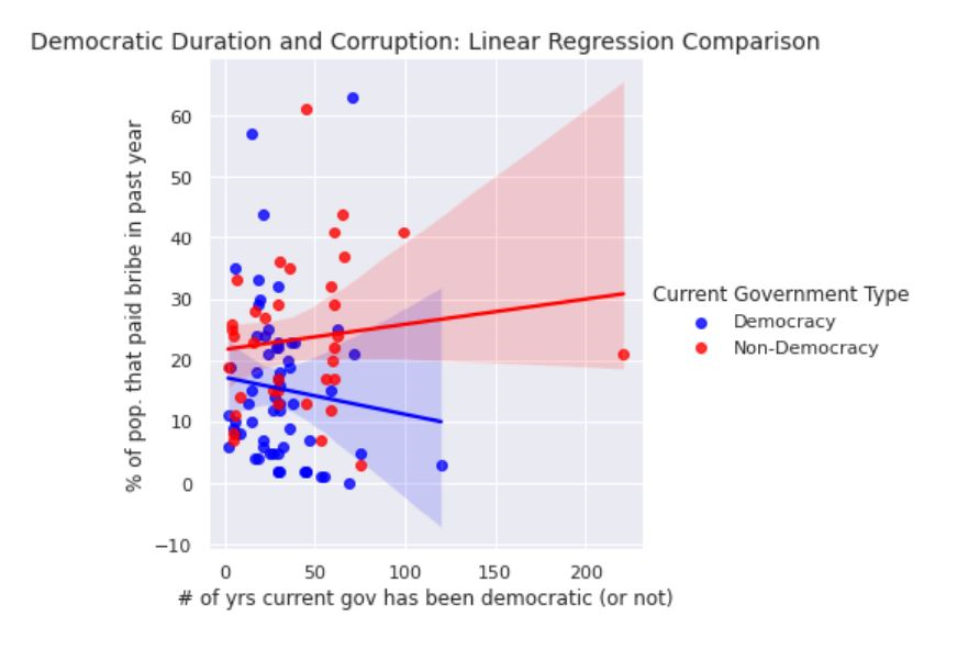
The scatterplot above explores the relationship between how long a country has or hasn’t been a democracy (x-axis) and the percentage of people in that country that report paying a bribe over the past year (y-axis), including regression lines to visualize the strength of the two correlations.
To explore this relationship I combined two datasets, one from Harvard that codes the democratic histories of countries and another dataset from Transparency International that records the percentage of people who reported paying a bribe in the last year. While the Harvard dataset contains every country, the Transparency International dataset is more limited, resulting in a combined dataset of 97 countries.
The regression lines in the chart above show a negative correlation between how long a democratic government has been in power and bribe prevalence and a slight positive correlation between bribe prevalence and the duration of non-democratic governments, suggesting that democracy may be helpful in lowering the prevalence of bribes in a country over time.
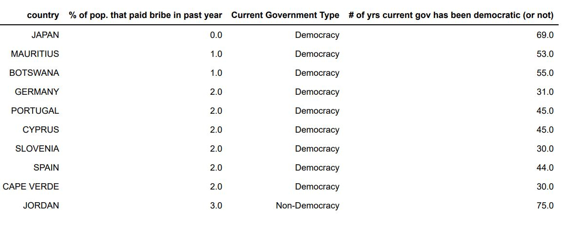
Top 10 Countries with the fewest reported bribes
We can see that the top 10 countries with the fewest reported bribes are mostly democratic countries:
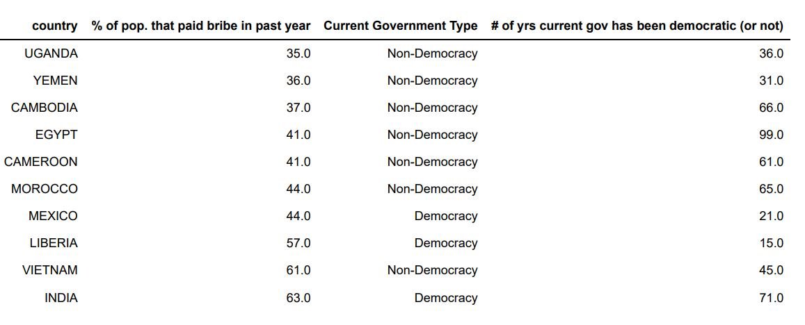
Top 10 Countries with the most reported bribes
Meanwhile the top 10 countries with the highest percentage of people reporting paying bribes in the last year are mostly non-democratic countries:
Focus on Democratic Countries
Narrowing our focus to just the democratic countries, if we eliminate the outlier of India with the highest percentage out of all countries of people who report paying a bribe in the last year, we see an even stronger negative correlation between the amount of time that a country has been a democracy and the percentage of people who report paying a bribe in the last year. Although we see a decently sized negative correlation between democracy duration and bribe prevalence, we can also see there are other factors at play as some new democracies have relatively low levels of bribe paying, whereas some older democracies (such as India) have higher levels.
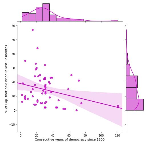
Using the Seaborn library’s jointplot I also included side plots of histograms showing the distributions of the x and y attributes in what is called a linear regression with marginal distribution plot. We see that the distribution of the prevelance of bribes (y-axis) in democracies skews right towards countries with lower bribe prevalence, whereas the distribution of democracies’ age (x-axis) reveals a more normal distribution with a large number of democracies between 20 and 40 years old, a phenomena that could be interesting to explore further.